کانون تبلیغاتی پرنیوم ویزیت
کلیه سفارشات تبلیغاتی
کانون تبلیغاتی پرنیوم ویزیت
کلیه سفارشات تبلیغاتیمن رو بشناس
 مسعود عباسیان هستم
مجری/مشاور/طراح تبلیغاتی با 20 سال سابقه خدمات و مدیریت در امور گرافیک و دیزاین
ادامه...
مسعود عباسیان هستم
مجری/مشاور/طراح تبلیغاتی با 20 سال سابقه خدمات و مدیریت در امور گرافیک و دیزاین
ادامه...
نکاتی که هر گرافیست باید بداند
طراحی، یک کسبوکار پیچیده، بغرنج، جالب و هیجانانگیز است و برای ورود به آن باید با زبان آن که همان عناصر و مفاهیم طراحی هستند، آشنا باشیم. همواره مسائل زیادی وجود دارند که باید یاد بگیریم، کارهای زیادی که باید انجام دهیم و چیزهای زیادی که تا وقتی مبتدی هستیم، باید در نظر بگیریم. البته این واقعیت وجود دارد که فناوری به طور مداوم در حال تکامل است، نرمافزارهای جدید انتشار مییابند و روندهای جدید به سرعت ظهور و بروز مییابند. اگر بخواهیم به واقعیت قضیه نگاه کنیم، همه این مسائل تا حدودی گیجکننده هستند.
بنابراین اجازه بدهید کمی مسائل را بازتر کنیم. در این نوشته ۲۰ اصل طراحی را به شما معرفی میکنیم که امیدواریم سرنخی برای ورود به این محیط خلاقانه به شما بدهند.
1. خط
مطمئناً همه ما میدانیم که خط چیست؛ اما برای اینکه اطمینان حاصل کنیم، باید اشاره کنیم که خطوط را میتوان با هر نوع نشانهای تعریف کرد. بنابراین وقتی دقت میکنیم، متوجه میشویم که خطوط در واقع تشکیل دهنده همه چیز هستند. حتی این کلمات و حروفی که در حال مطالعه آن هستید هم از هزاران خط منحنی، زاویهدار و مستقیم تشکیل یافتهاند.
خطوط توانایی هدایت ایدهها را نیز دارند. خطهای مستقیم، حس نظم و تمیزی را القا میکنند، خطوط مواج حرکت ایجاد میکنند و خطهای زیگزاگ میتوانند باعث ایجاد تنش یا هیجان شوند. یکی از تکنیکهایی که در عکاسی زیاد استفاده میشود، بهرهگیری از «خطوط هدایتگر» است که همان کاری را انجام میدهند که از نامشان برمیآید، یعنی چشمها را هدایت میکنند. یافتن و تأکید بر خطوط هدایتگر غربی در طراحی باعث میشود که بتوانید چشمان بیننده را بر روی کل طراحی خود هدایت کنید یا به برخی نقاط کلیدی آن متمرکز کنید.با استفاده صحیح از خطوط میتوان یک تصویرسازی را به نحو عالی صفحهبندی کرد
خطوط، اجزای گرافیکی متنوع، ساده و مؤثری هستند که هرگز نباید اهمیت آنها را نادیده بگیرید. آنها را همین امروز مورد آزمایش قرار دهید و ببینید که چه نتایج جالبی در طراحیهای شما ایجاد میکنند.
2. مقیاس
مقیاس در برخی موارد به معنی واقعی کلمه بخش بزرگی از طراحی است. سادهترین تعریفی که برای مقیاس میتوان بیان کرد به این صورت است که مقیاس شامل اندازه بندی دلخواه اجزای منفرد یک طراحی است. مقیاس میتواند به معنی یافتن طراحیها و تصاویر کمک کند. مثلاً اگر بخواهیم یک موش را در کنار فیل طراحی کنیم، مسلماً باید موش را بسیار کوچکتر از قیل بکشیم تا بینندگان بیدرنگ معنی تصویر را درک کنند.
بدین ترتیب مقیاس به ما کمک میکند که معنی چیزها را بیابیم. اما لازم نیست مقیاس همیشه بر مبنای واقعگرایی باشد. میتوان اجزای مختلف را بسیار بزرگ یا کوچک ترسیم کرد تا در مخاطب حیرت ایجاد کرده و نشانهای به وی ارائه دهند که کدام بخش از طراحی اهمیت بیشتری دارد و کدام بخش کماهمیتتر است.این مقیاسبندی برای نشان دادن اهمیت عناصر طراحی معمولاً «سلسهمراتب» نامیده میشود که در ادامه بیشتر به آن خواهیم پرداخت.
3. رنگ
البته اهمیت رنگ در طراحی بر هیچ کس پوشیده نیست؛ اما در این نوشته که به اجزا و مفاهیم طراحی مربوط است، ناگزیر هستیم بار دیگر بر اهمیت آن تأکید کنیم. رنگ، یکی از مهمترین اجزای طراحی است. رنگ باعث ایجاد حس و حال و اتمسفر در تصویر میشود و عواطف را هدایت میکند. هر طیف رنگ، معنا و مفهوم ضمنی خاصی برای خود دارد. به طور خلاصه رنگ میتواند باعث موفقیت یا شکست یک طراحی شود.رنگ، مفهومی نیست که تنها به اجزای مورد استفاده برای برندسازی محدود شود، بلکه در همه چیز حتی عکاسی نیز مهم است. فیلترهای رنگی و تصحیح رنگ در عکاسی باعث شدهاند که بتوانیم رنگبندی و تنالیته عکسها را ویرایش کنیم.
یا تاکنون یک پوستر براق و شلوغ طراحی کردهاید؟ چرا از یک فیلتر تکرنگ شبیه فیلمهای نوآر بر روی عکسهای خود استفاده نمیکنید؟ شاید هم میخواهید تصویر شما ظاهری غافلگیرکننده داشته باشد. در این صورت با افزایش کنتراست عکس، رنگهای آن تا حدودی خنثی میشوند و نرمتر و صافتر میشود.
4. تکرار
هر برندی را که بخواهید تصور کنید مانند کوکاکولا، گوگل، اپل یا نایک. مطمئناً میتوانید لوگوی آنها را به خاطر بیاورید، تم هندسی کلی آنها را تشخیص دهید و رنگبندی آنها را به یاد بیاورید. چرا این تصاویر تا این حد در خاطر میمانند؟ تنها دلیل آن تکرار است.تکرار یکی از اجزای مهمی است که در طراحی برندسازی استفاده میشود. تکرار هم به صورت منسجم ساختن طراحی برند و هم برحسب متصل کردن اجزای آن به هم انجام میگیرد.
تکرار یکی از اجزای کلیدی در برندسازی است؛ اما در طراحیهای منفرد هم میتوان از آن استفاده کرد. برای نمونه هنگام ایجاد پالتهای رنگ و بافتها میتوان از تکرار به عنوان یک عنصر کلیدی استفاده کرد.
5. فضای منفی
خدمات جدید این موسسه
تصحیح - ویرایش و راسته کردن فیلم . فیلمبرداری شده توسط دوربین موبایل که در کامپیوتر بصورت کج یا افقی نشان داده می شود . و برگشت به حالت عادی نمایش . جهت دریافت اطلاعات کافی لطفا با بخش مدیریت تماس بگیرید .
با تشکر
به یک نرم افزار عمیق نگاه کن
روی سخنم با شما هنرور ارجمند -
شاید بارها و بارها که بر حسب احتیاج شغلی و یا آموزشی و یا کاری احتیاج به خرید یک نوع نرم افزار خاص و یا معمولی در رده کاری و هنری و دانشی خود از بازار پیدا کرده و خرید کرده ای در این راستا مدتی بعد هم بی استفاده به گوشه ای گذاشتی ولی غافل از اینکه این نرم افزار چگونه و چطور ساخته شده . هیچ و هیچ اطلاعی از رازها و اسرار پشت پرده ساخت این نرم افزار ندارید . بگذارید در یک جمله برای شما تشریح کنم که یک نرم افزار به چه صورت ساخته می شود تا شما قدردان نویسندگان و تهیه کنندگان همان نرم افزار باشید هنگامی که شما یک نرم افزار را از یک برنامه نویس خریداری می کنید ، در اصل شما بیشتر از یک نرم افزار خریداری کرده اید .
نکته اینجاست
یعنی شما در حال خرید ساعتها و ثانیه ها مغز و ذهن و اعصاب یک شخص هستید
یعنی شما در حال خرید ساعتها دعوا و مشاجره بر سر قسمتهای از برنامه به نام فیلد وبین دیتابیس هستید
یعنی شما در حال خرید مشاجره بر سر حتی کوچکترین عضو یک برنامه به نام آیکون یا لوگو که در گوشه و کنار برنامه استفاده می شود هستید
چون ساخت یک برنامه و نرم افزار کار تیمی است که بین چند نفر تقسیم می شود شما در حال خرید ساعتها مشاجره و بی خوابی و و از کارافتادگی اعضای گروه هستید .
شما در حال خرید ساعتها رنج و مشقت ساخت یک نرم افزار هستید
شما در حال خرید ساعتها تا صبح بیدار ماندنها هستید
شما در حال خرید محدود شدن آزادیهای زندگی و ثانیه های از دست رفته زندگی هستید .
با این وجود آیا شده به این روی سکه هم کمی فکر کنید .
آیا شده کمی به فکر سختیهای این شغل هم باشید .
آیا شده که خودتان هم کمی مزه آن را چشیده باشید . وقتی به تمامی اینها فکر و اندیشه کرده باشید اینجاست که معنای واقعی کپی رایت را درک خواهید کرد . بله همیطور است از این پس قبل از خرید هر نرم افزاری در درجه اول به این موارد توجه خاص داشته باشید
در پایان سپاس برای نگهداری از نرم افزارهایتان
قابل توجه
برای حمایت از کانال تلگرامی ما دوستان خود را هم دعوت کنید
ما در تلگرام در کنار شما هستیم با آی دی زیر با کانال ما در ارتباط باشید
preinumvisit@
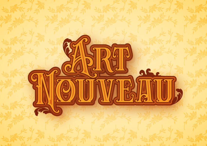
How to Create an Art Nouveau Text Effect in Illustrator
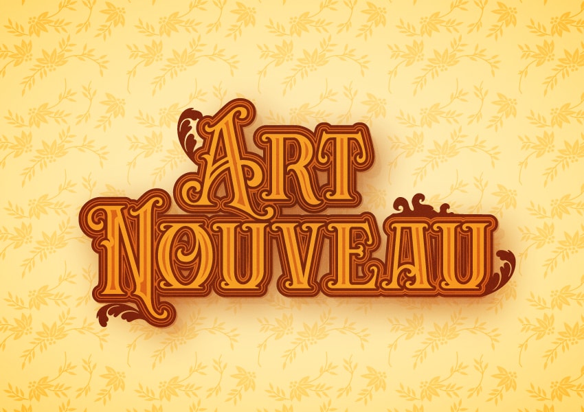
In this Art Nouveau Illustrator tutorial, you will learn how to turn an Art Nouveau font into a mesmerizing Art Nouveau text effect.
What You'll Learn in This Art Nouveau Illustrator Tutorial
- How to create a new document in Illustrator
- How to use patterns in Illustrator
- How to use an Art Nouveau font
- How to use the Appearance panel in Illustrator
- How to use Art Nouveau Illustrator brushes
For more inspiration on how to adjust or improve your Art Nouveau font styles, you can find plenty of resources at GraphicRiver.
What You Will Need
You'll need the following resource in order to complete this Art Nouveau Illustrator tutorial:
- Carllosta font
1. How to Create a New Document
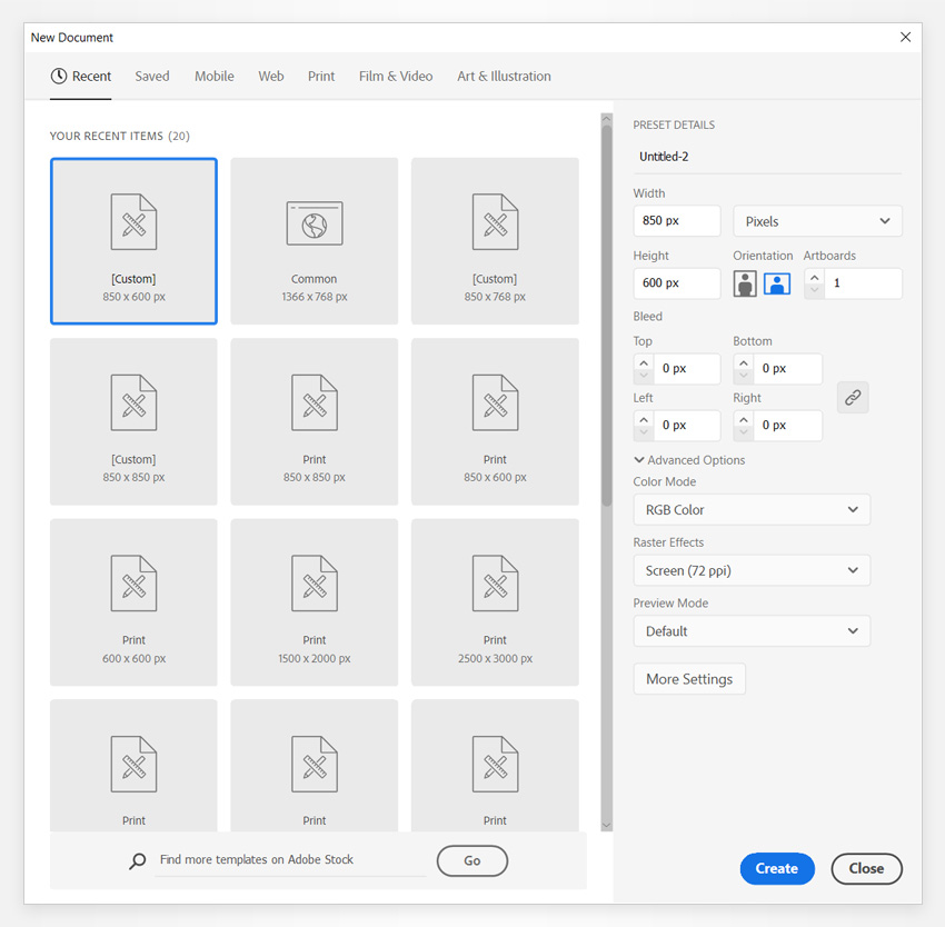
Hit Control-N to create a new document. Select Pixels from the Units drop-down menu, and enter 850 in the Width box and 60 in the Height box. Select RGB for the Color Mode, set the Raster Effects to Screen (72 ppi), and then click the Create button to create your new document.
2. How to Create the Background
Step 1
Pick the Rectangle Tool (M) and focus on your toolbar. Remove the color from the stroke, and then select the fill and set its color to R=255 G=233 B=183.
Move to your artboard and simply click on it to open the Rectangle window, where you can set the size of the shape that you're about to create. Set the Width to 870 px and the Height to 620 px, and then click OK to create your rectangle. Press the Escape key to easily switch to the Move Tool and move your rectangle so it covers the entire artboard, as shown in the following image. 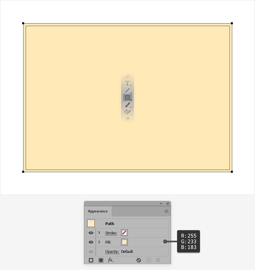
Step 2
Open the fly-out menu from the Swatches panel (Window > Swatches) and go to Open Swatch Library > Patterns > Nature > Nature_Foliage to open the small set of built-in patterns.
Make sure that your rectangle is still selected, focus on the Appearance panel (Window > Appearance), and add a second fill using the Add New Fill button. Select the new fill, apply the Floral Vines pattern, and then change the blending mode to Soft Light.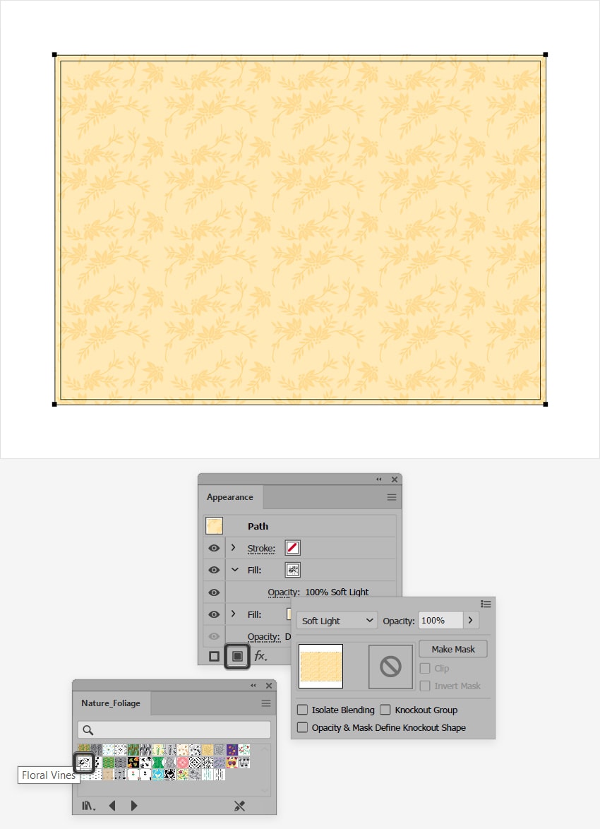
3. How to Create the Text Effect
Step 1
Now let's add the Art Nouveau text using this Art Nouveau font. Once you've installed the font, pick the Type Tool (T) and focus on the Character panel (Window > Type > Character). Select the Carllosta font, and then set the font size to 200 px and the Leading to 130 px.
Click on the artboard and type in your text. You have plenty of Art Nouveau font styles to choose from if you wish to use a different font. 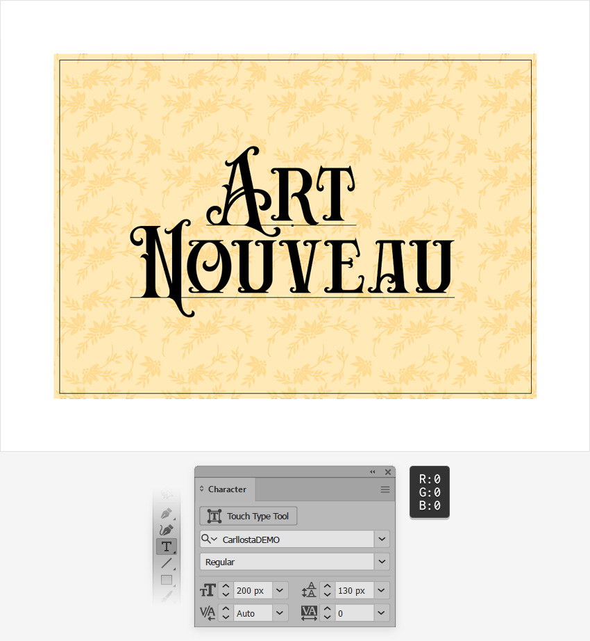
Step 2
Make sure that your Art Nouveau text stays selected, open the Swatches panel (Window > Swatches), and click that [None] swatch to remove the existing text color. This should make your text invisible, but don't worry—we'll fix it immediately.
Open the Appearance panel (Window > Appearance) and add a new fill using that same Add New Fill button from the bottom of the panel. Select the new fill and set its color to R=243 G=153 B=39.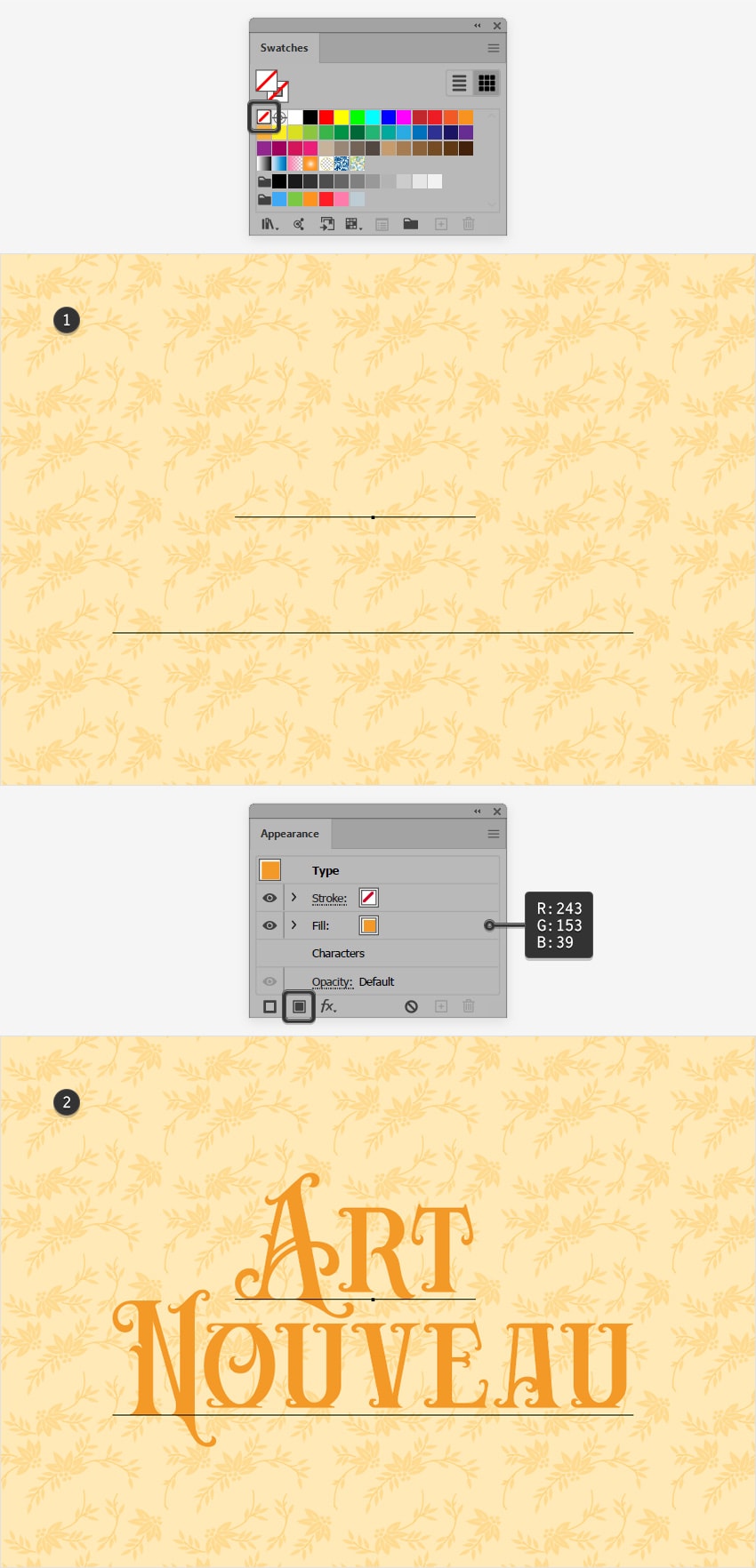
Step 3
Make sure that your Art Nouveau text remains selected, and keep focusing on the Appearance panel.
Add a second fill and move it below the existing one. Select it and change the color to R=105 G=37 B=16, and then go to Effect > Path > Offset Path. Set the Offset to 4 px, select Round from the Joins drop-down menu, and then click OK. 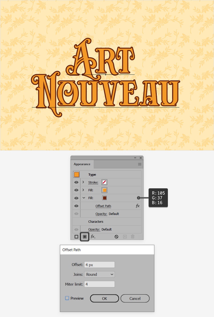
Step 4
Make sure that your Art Nouveau text is still selected, and keep focusing on the Appearance panel.
Add a third fill and move it below the existing fills. Select this new fill and change its color to R=206 G=97 B=28, and then go to Effect > Path > Offset Path. Set the Offset to 9 px, select Round from the Joins drop-down menu, and then click OK. 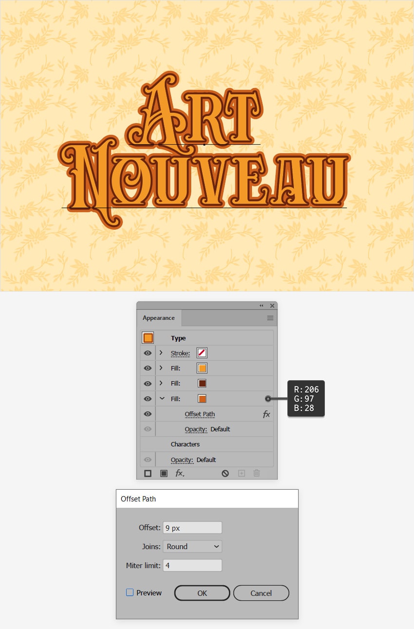
Step 5
Make sure that your Art Nouveau text is still selected, and keep focusing on the Appearance panel.
Add a fourth fill and move it below the existing fills. Select this new fill and change its color to R=105 G=37 B=16, and then go to Effect > Path > Offset Path. Set the Offset to 13 px and select Round from the Joins drop-down menu, and then click OK.
Reselect the fill added in this step, and go to Effect > Stylize > Drop Shadow. Enter the attributes shown in the following image, and then click OK.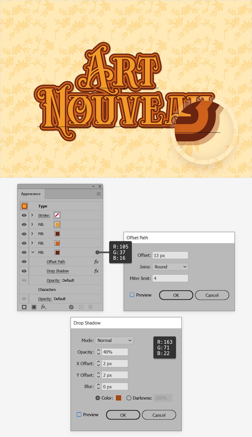
Step 6
Make sure that your Art Nouveau text is still selected, and keep focusing on the Appearance panel.
Add a fifth fill and move it below the existing fills. Select this new fill and change its color to R=163 G=71 B=22, and then go to Effect > Path > Offset Path. Set the Offset to 8 px and select Round from the Joins drop-down menu, and then click OK.
Reselect the fill added in this step, lower its Opacity to 10%, and then go to Effect > Distort & Transform > Transform. Drag both Move sliders to 15 px and click OK. This effect will move your fill 15 px up and 15 px to the right. 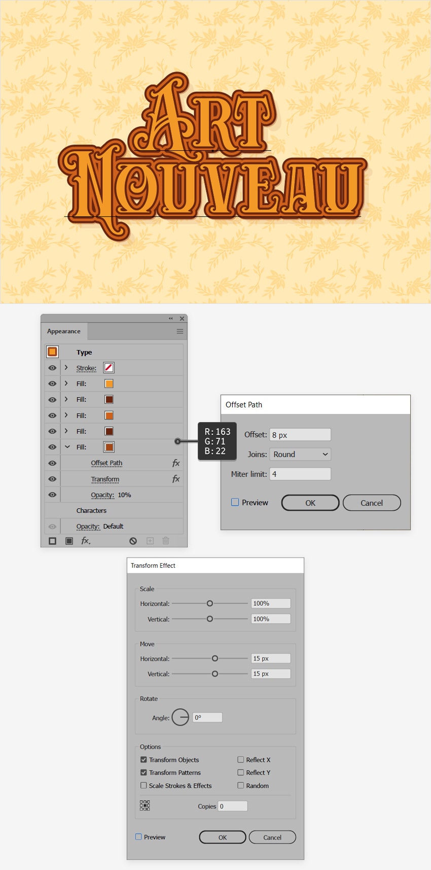
Step 7
Make sure that your Art Nouveau text is still selected and keep focusing on the Appearance panel.
Add a sixth fill and move it below the existing fills. Select this new fill, make sure that the color is set to R=163 G=71 B=22, and then go to Effect > Path > Offset Path. Set the Offset to 6 px and select Round from the Joins drop-down menu, and then click OK.
Reselect the fill added in this step, and go to Effect > Distort & Transform > Transform. Make sure that both Move sliders are set to 15 px, click OK, and go to Effect > Blur > Gaussian Blur. Set the Radius to 25 px and click OK. 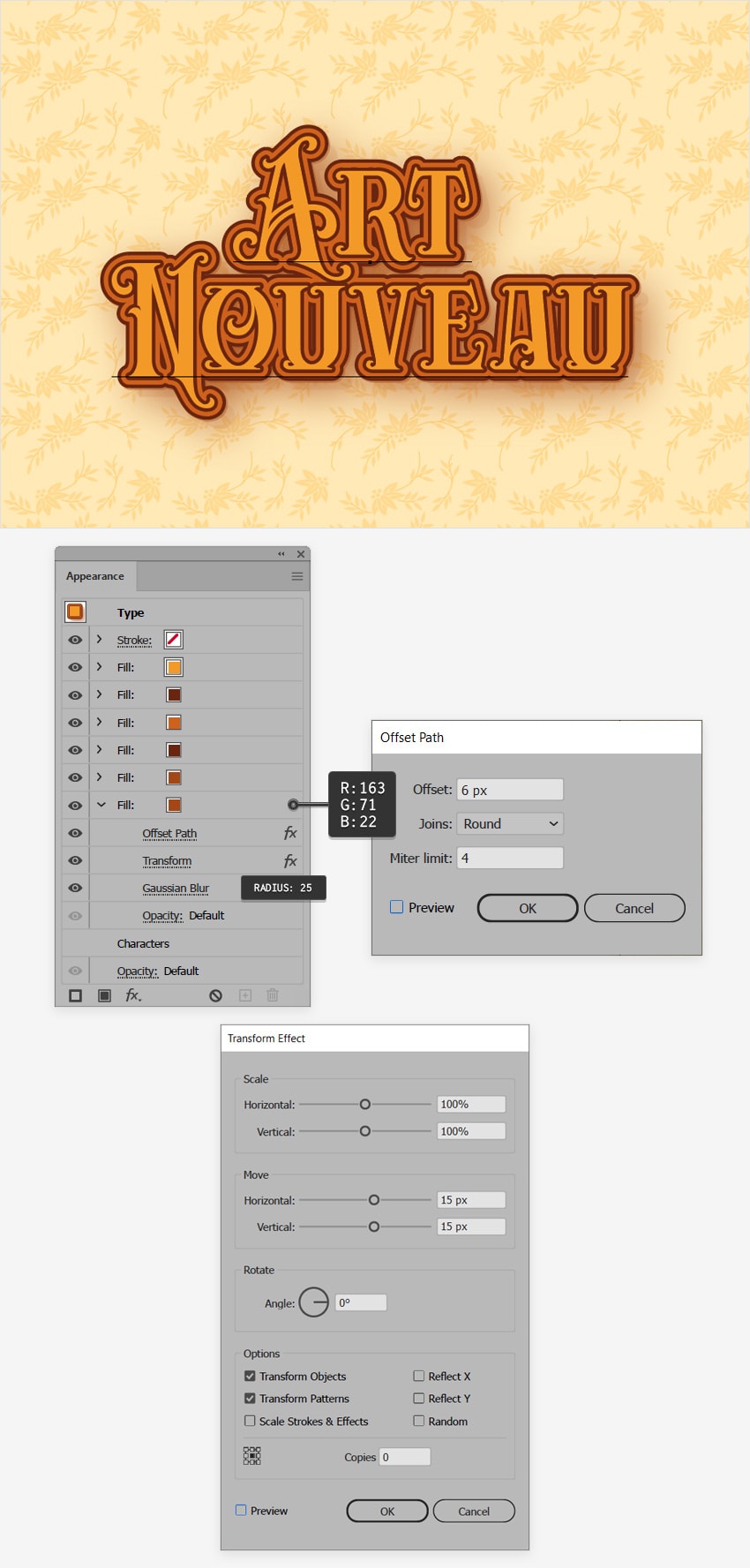
Step 8
Make sure that your Art Nouveau text is still selected, and keep focusing on the Appearance panel.
Select the top fill and add a new one on top of it. Change the color of this new fill to R=206 G=97 B=28, and then go to Effect > Path > Offset Path. Set the Offset to -6 px and select Round from the Joins drop-down menu, and then click OK. 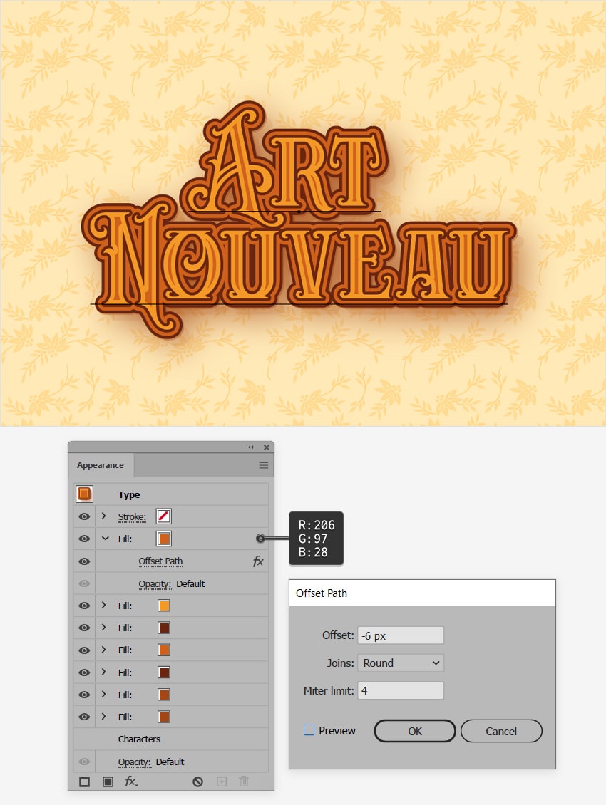
Step 9
Make sure that your Art Nouveau text is still selected, and keep focusing on the Appearance panel.
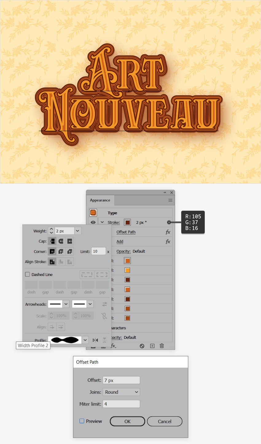
Click that Stroke button to open the Stroke fly-out panel, set the Weight to 2 px, and select Width Profile 2 from that Profile drop-down menu. Change the color of this stroke to R=105 G=37 B=16, and then go to Effect > Path > Offset Path. Set the Offset to -6 px and select Round from the Joins drop-down menu, and then click OK.
Make sure that the stroke is still selected, and go to Effect > Pathfinder > Add.
4. How to Add Art Nouveau Illustrator Brushes
Step 1
Now, let's add some Art Nouveau Illustrator brushes. Open the fly-out menu from the Brushes panel (Window > Brushes) and go to Open Brush Library > Decorative > Elegant Curl & Floral Brush Set to open a small set of built-in brushes.
Select Floral Brush 12 from this list, and simply drag it onto your artboard. Change its color to R=105 G=37 B=16. Make two extra copies (Control-C > Control-V) and then place these shapes around your text, as shown in the first image.
Select Waves 2 from the same list and add it to your design. Fill it with the same color and place it as shown in the second image. 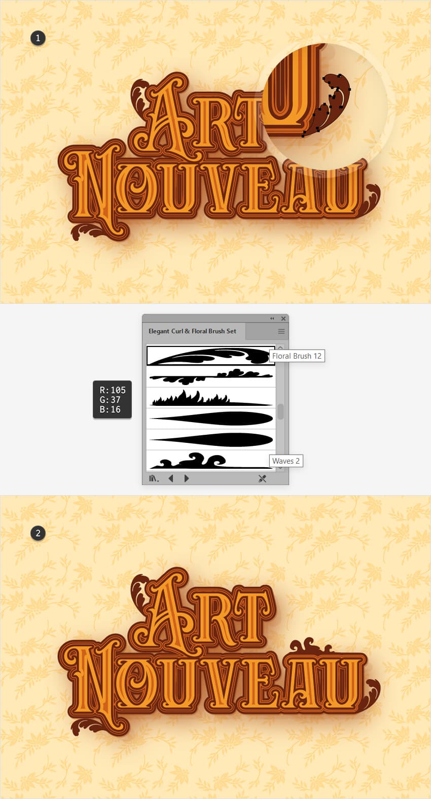
Step 2
Select the rectangle that makes up your background, add a copy in front (Control-C > Control-F), and bring it to the front (Shift-Control-]).
Make sure that this new shape stays selected, and press the D key to replace the current Appearance attributes with the default ones (white fill and black stroke). Remove the stroke color and select the fill from the Appearance panel. Change its blending mode to Overlay and then apply the radial gradient shown below. Use the Gradient Tool (G) to stretch and squeeze your gradient as shown in the second image. Remember that the left gradient slider should have the Opacity set to 0%. 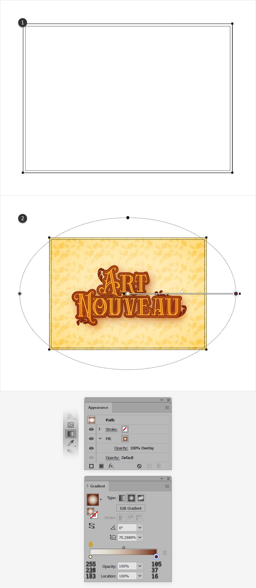
Step 3
Make sure that your gradient filled shape is still selected, and keep focusing on the Appearance panel.
Add a second fill, select it and change the color to R=92 G=43 B=2. Lower its Opacity to 10% and change the blending mode to Overlay, and then go to Effect > Artistic > Film Grain. Enter the attributes shown below and click OK.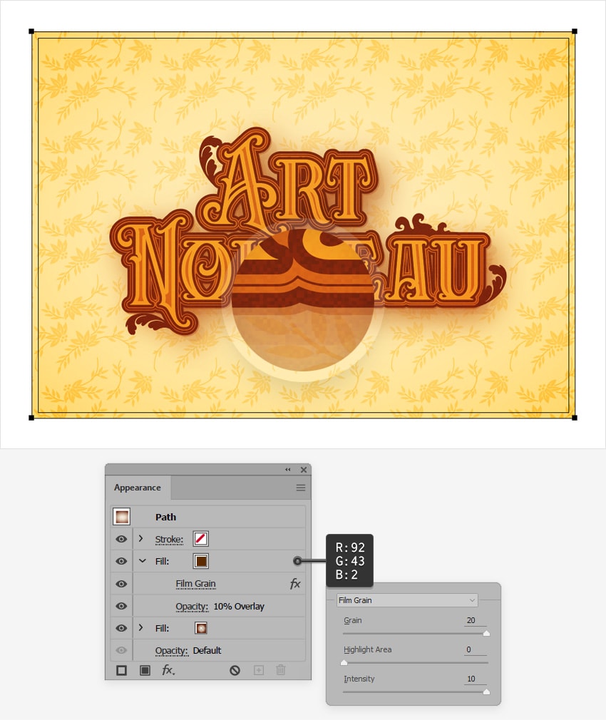
Congratulations! Your Art Nouveau Text Effect Is Complete!
Here is how it should look. I hope you've enjoyed this Art Nouveau Illustrator tutorial and can apply these techniques in your future projects. Don't hesitate to share your final result in the comments section.
Feel free to adjust the final design and to try different Art Nouveau font styles. You can find some great sources of inspiration at GraphicRiver, with interesting solutions to improve your Art Nouveau text effect.